
Made to be
recognizably free.
One forward-moving S. Three purposeful colors. A straightforward identity for software that puts people in control.
Small mark. Clear intent.
The folded S carries a little forward motion. Use the lime tile as the primary app icon and the horizontal signature when the name needs to travel with it.



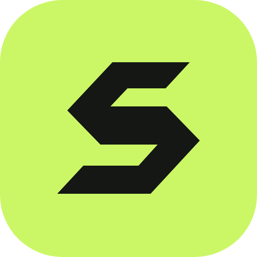


Quiet canvas. Strong signal.
Use ink for readable text, paper for breathing room, and lime for emphasis. Always pair lime surfaces with ink text.
Native type. Plain English.
Your consent.
Not a subscription.
Confident, without the weight.
Use the system sans-serif font. Bold, tightly spaced headlines. Comfortable body copy. Short monospace labels. No web font to download.
Say what you mean.
Direct, independent, transparent, and human. Be clear about what works, what is still developing, and what will always be free.
Ready to share.
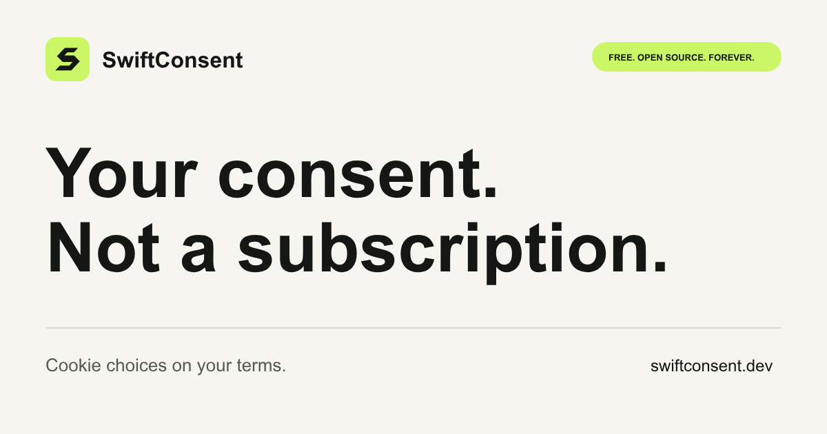

A few useful boundaries.
Give the mark room.
Leave clear space equal to at least a quarter of the icon width. Keep its proportions and use the supplied color variants. Icons work from 16 px; the full signature works from 140 px.
Keep it simple.
No gradients, stretching, drop shadows, or busy backgrounds. Start from the vector masters. Use an 8 px spacing rhythm and respect reduced-motion preferences.